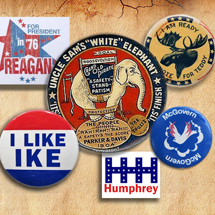
While there seems to be a lot of curiosity about the 2020 presidential race, most of us are probably not yet ready to invest hours watching town hall meetings on cable news. At this point in the campaign, almost a year before the first primaries, it can be just as fun – though completely subjective – to ruminate on the candidates’ logos.
As with any brand, voters draw conclusions about political candidates from how they market themselves. Strong visual presentations can project confidence, strength or ingenuity; mediocre ones can project insecurity or lack of focus.
For those who doubt the impact of a candidate’s insignia, consider the cautionary tale of Jeb Bush. Political pundits had plenty of theories about why Bush – the best known and best-funded 2016 Republican presidential candidate – flopped with the voters. But are we looking too hard for the answer?
Here’s a theory: It was Jeb’s unconventional logo. Bush’s stickers and signs featured his first name in puffy red letters followed by an exclamation point. Somehow a serious, two-term governor was running as an excited eight-year-old boy.
By contrast, consider the now-iconic Barack Obama symbol of 2008. We were never quite sure if it was supposed to be a rising sun or a decorative “O,” but, oh well, it looked pretty sharp on a campaign button. That year, Obama upended the early Democratic front runner, Hillary Clinton, whose traditional emblem – her first name underlined by an American flag – paled in comparison.
Subsequent candidates, including Mitt Romney, Ted Cruz and Clinton herself followed Obama’s lead with more polished and imaginative logos. (Proving that Jeb’s logo designer may not have been completely at fault, none of these latter candidates made it over the top either.)
So what about the 2020 field? Our creative team had mixed opinions (Pete Buttigieg’s logo was chosen as both the best and the worst), but also some hints of consensus. Joe Biden’s logo has a “good, subtle take on the American flag,” according to one designer, and, according to another, it “feels presidential.”
On the other end of the spectrum is Kamala Harris. “Viewing it from a purely visual standpoint,” one designer said, “this logo is overdone and disorganized.”
Lest anyone accuse us of an unscientific analysis, let us just say: You’re right. While logos may say something about the candidates behind them, their appeal is largely subjective and secondary to a campaign’s substance.
But as voracious observers of design trends, we have to make one final point: While none of the 2020 political brands may stand out the way Obama’s did, they do appear to have learned from at least one mistake of the past – not one of them uses an exclamation point.